1. The Gallery
1.2 Why Create a Pure CSS Gallery?
As an illustrator and designer, I’m always looking for new ways to present my work online. For some time, I’ve wanted to learn how to build my own portfolio gallery from the ground up so that I have as much control over how my work is presented as possible. However, most online galleries which I came across used either JavaScript or Flash. I’m not yet familiar enough with Java Script to design a gallery with it and Flash tends to slow a page down and is increasingly not being supported by newer browsers and devices.
With recent advances in HTML and CSS, I had a feeling that there must be a way to replicate the functionality of the JavaScript galleries that I saw using pure HTML and CSS. After doing some more research and some trial and error I have finally been able to figure out how to do so.
1.2 Who is This Tutorial For?
I designed this gallery specifically with illustrators and designers like myself in mind, but it should also work perfectly well for photographers, decorators, restaurants or anyone else who needs an image gallery for their website.
In this tutorial I will be assuming that you already have a basis in the basics of HTML and CSS and know the basics of how to lay out a web page and style it. I will be focusing specifically on how to create your own image gallery using only HTML and CSS. No JavaScript or Flash required!
I will also be assuming that you have a basic understanding of how to crop and adjust the sizes of images in Photoshop or a similar image editing program. If you need more information about any of these topics, then there are lots of great tutorials out there that focus on them.
1.3 What Will This Gallery Do?
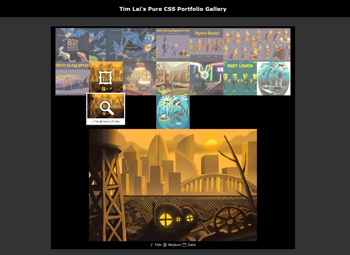
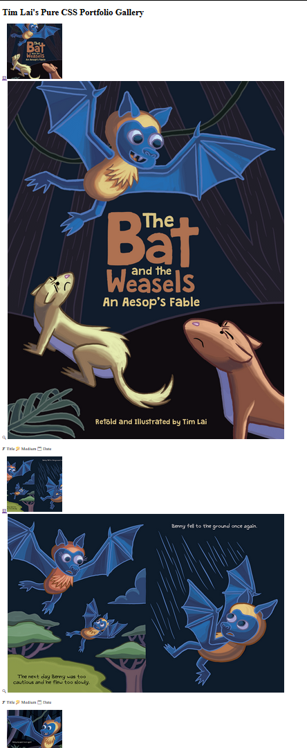
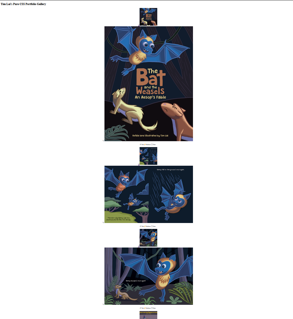
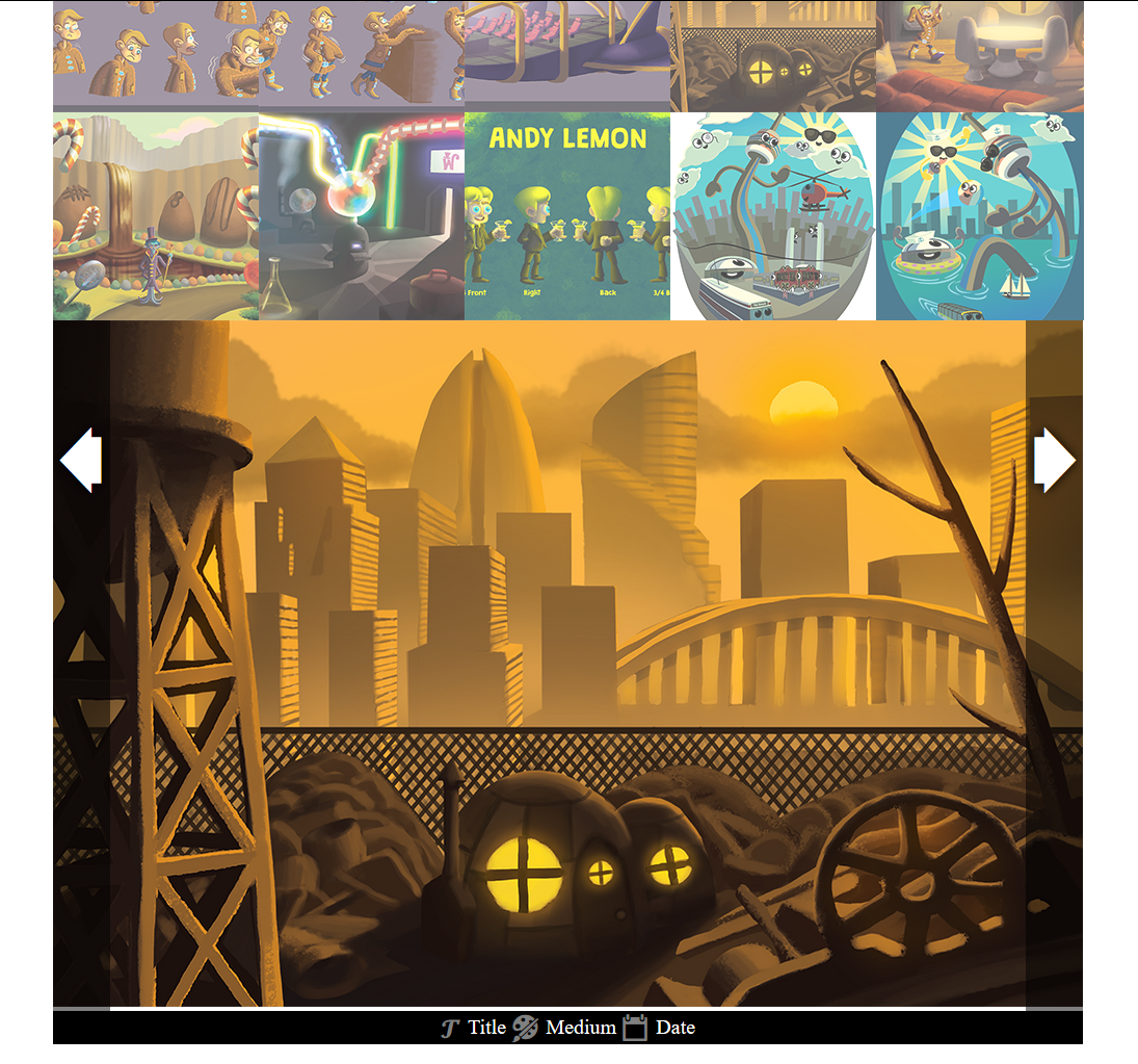
This gallery will feature a series of cropped, square thumbnail images. When you click on those images the full respective illustration or image will load below the thumbnails. The viewer will also be able to cycle from one image to the next by clicking on “previous” and “next” arrows that will show up when they hover over the full image. There will also be a caption under the full image where you can put the title of the image, medium of the illustration, date of creation or just a general description of the image.
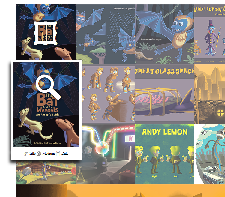
I also designed a neat additional, but optional feature where a small pop-up preview of the uncropped image appears when the user hovers over each thumbnail. When the user hovers over the preview they can also enlarge it. There is also a space for a small caption under these image previews.
Why would you want to include this in your gallery? Well, depending on how many thumbnails you have, your user might not want to have to constantly click on the thumbnails and scroll back up to the top of the page to find the image they’re looking for. If you had over thirty thumbnails on a page then that could quickly get annoying. This way they can preview the full image before they click on it, find the one they want, and click on that one if they want to view the full size image. I will show you how to include this feature but it’s optional if you don’t feel that it’s necessary for your gallery.
You can view a fully functional demo of the gallery here.
2. Your Images
2.1 Preparing Thumbnails
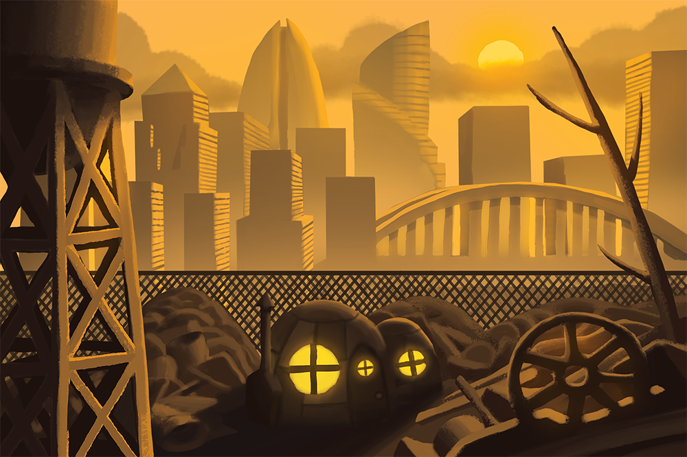
The first step to creating your gallery is to prepare the images that you will be using in it. As an illustrator I’m frequently doing illustrations that are different sizes and dimensions so I tried to ensure that the gallery could accommodate this. As a result, your full size images can be of almost any size, as long as they aren’t too unusually wide or tall and as long as they are all at least a thousand pixels wide or more. If you don’t already save copies of your images that large, then you should!
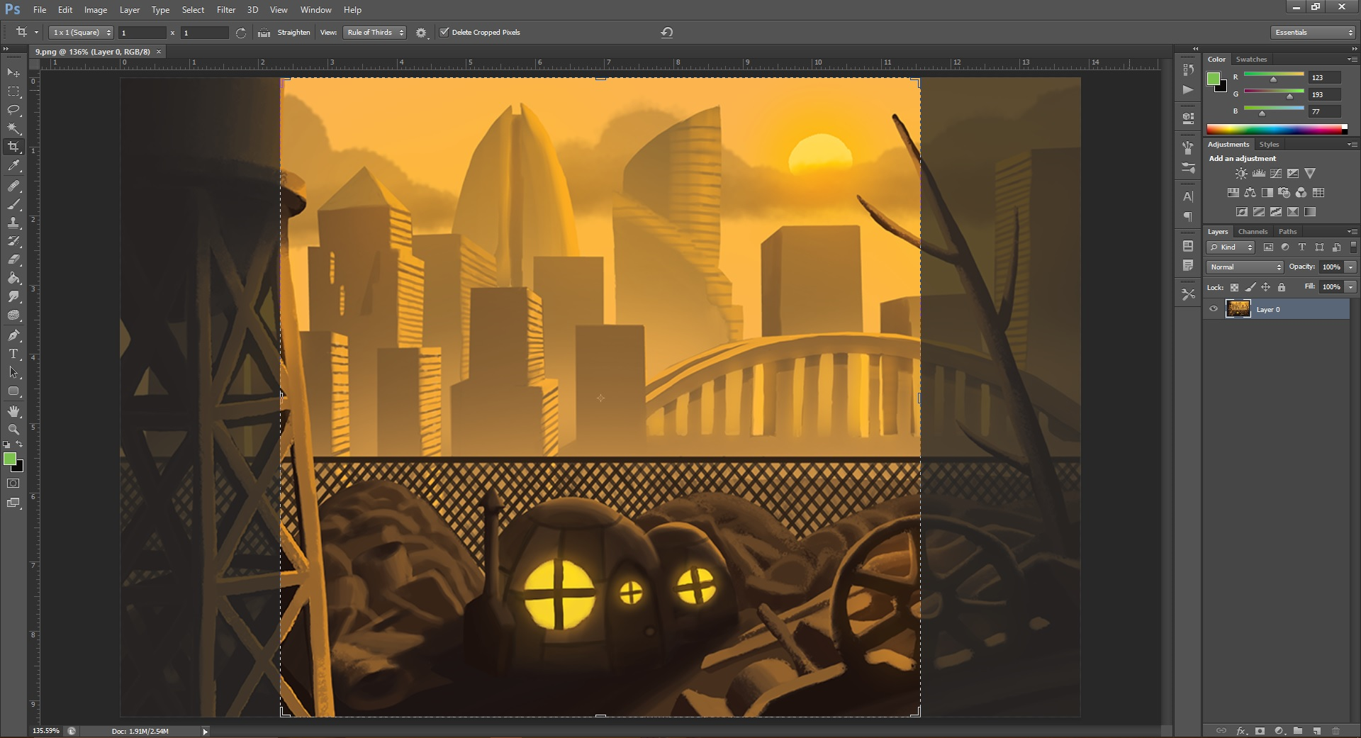
The only image editing that is really necessary for this gallery is for the creation of the thumbnails. Take all of your full size images into Photoshop, or a comparable image editing software of your choice, crop them all as 1:1 squares and resave them at 200px x 200px. You could always save them at a bigger or smaller size but I feel that 200px is a nice size for a thumbnail and if you choose a different size then you’ll have to figure out how that affects the other dimensions of the gallery.
2.2 Image Naming and Organization
For the purposes of organizing the gallery it is easiest if all of the images are named numerically i.e. 1.png, 2.png, full1.png, thumb1.png etc. Save all of your full size images in a new folder within your images folder called “full.” Save all of your 200px x 200px thumbnails in a separate folder within your images folder called “thumb.”
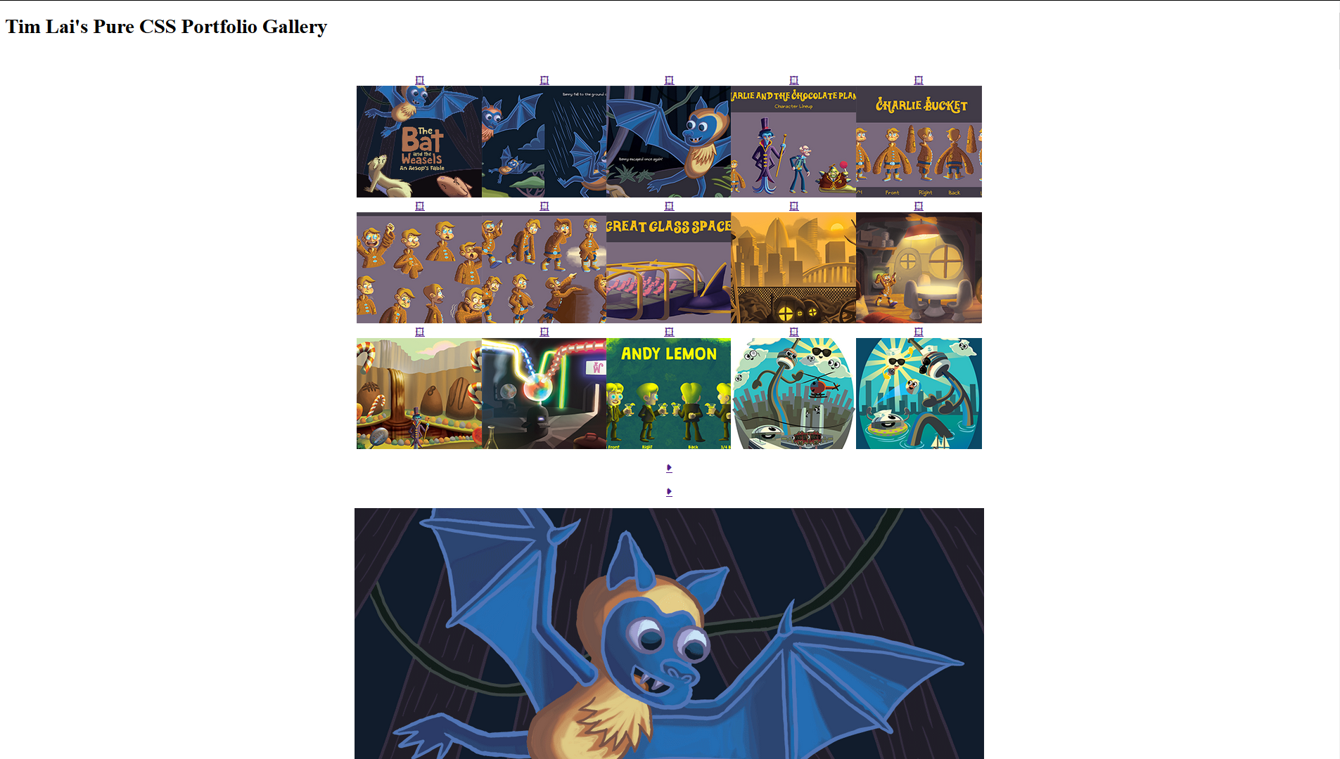
I have twenty images in the demo gallery on this page but theoretically you can have as many or as few as you want! It would be weird if you only had one or two images though.
3. The HTML
3.1 The Gallery Container
Once your images are prepared you can move on to the coding process. First, create a container for the whole gallery using a div and give it an ID of #gallery like this:
        	<!-- GALLERY CODE STARTS HERE -->


        	<div id="gallery"><!-- start gallery container -->
3.2 The Thumbnails
Now you can start adding the thumbnails. Each thumbnail will have a chunk of code that looks like this:
<!-- THUMBNAIL CODE STARTS HERE -->
<div class="thumb" id="thumb1"><!-- start thumbnail container 1 -->
<a href="#full1">
<span class="img-link">🖽</span><!-- gallery link symbol -->
<img src="images/thumb/1.png" alt="Thumb" width="200" height="200">
</a>
</div><!-- end thumbnail container 1 -->
First, create a container for the thumbnail and give it both a class of “thumb” and a numbered ID of “thumbX,” where X stands for the number of the thumbnail i.e. thumb1, thumb2, thumb3 etc.
Then create an anchor (link) tag and link it to the ID anchor point of “#fullX,” so that it will link to the full size version of our image when we’re done. Inside the anchor tag, using a span tag I’ve added an optional symbol indicating that the user can click on the thumbnail to open the image in the gallery. You don’t have to add this line if you don’t want to. Put your thumbnail image below that and then close up the anchor tag and the thumbnail container, unless you want to include the pop-up preview of the full image. In that case, proceed to the next step. If not then skip to step 3.4.
3.3 The Pop-up Preview
To add the pop-up preview to your thumbnail add the following code after your anchor tag, inside of your thumbnail container:
<div class="expand" id="expand1"><!-- start expand image container 1 -->
<span class="img-mag">🔍</span><!-- magnifying glass symbol -->
<img src="images/full/1.png" alt="Full">
<div class="caption"><!-- start caption container -->
<p>
<span class="title">𝓣</span>Title <span class="medium">🎨</span>Medium <span class="date">📆</span>Date
</p>
</div><!-- end caption container -->
</div><!-- end expand image container 1 -->
</div><!-- end thumbnail container 1 -->
That looks like a lot of code for a little thumbnail. Let me break it down for you. First, simply create a container with a class of “expand” or “preview” and an ID of “expandX,” where X corresponds with the number of the image. Inside the expand container, using a span tag, I’ve included a symbol of a magnifying glass to indicate that people can hover over the preview to enlarge it. This is optional. After that, insert your full size image.
Underneath your image create a container for your image caption with a class of “caption” and put a paragraph tag inside it. I included places for my illustration title, medium and date with symbols to represent those, but you can put whatever you want here. Then close up your caption container, expand container, and thumbnail container.
Just copy and paste the thumbnail code for every image that you want to put in your gallery and change the numbers in the file names and IDs to correspond with your respective images. We’re done with the thumbnail HTML. Now to move onto the full images!
3.4 The Full Images
Now that the thumbnails are in place we need to create the image viewer where the full size images will appear when the user clicks on the thumbnails. As with the thumbnails, start by creating a div with a class of “full” and an ID of “fullX” to act as a container for the full size images.
Next create an anchor tag that will link to the previous image in your gallery (in this case that is the twentieth image as there are twenty images in my gallery and this is the first). Inside the anchor tag create a div with a class of “prev” and put a paragraph tag inside it. In the paragraph tag, put the symbol ➧ which is an arrow symbol, and close up the paragraph, div and anchor.
<!-- FULL IMAGE CODE STARTS HERE -->
<div class="full" id="full1"><!-- start full image container 1 -->
<a href="#full20"><!-- start previous/next arrows -->
<div class="prev"><p>➧</p></div>
</a>
<a href="#full2">
<div class="next"><p>➧</p></div>
</a><!-- end previous/next arrows -->
<img src="images/full/1.png" alt="Full">
Copy and paste the code for the “previous” arrow to use for the “next” arrow. Replace the anchor link with the ID of the next image in the galley and change the class to “next.” Underneath the “previous” and “next” arrows, insert your full size image.
Once we add in the code for the caption under the full size image we’ll be done with the HTML. Just like the caption for the preview in step 3.3, create a container for your image caption with a class of “caption” and put a paragraph tag inside it. I included places for the title, medium and date of my illustration and added some symbols to go beside them but you can put any information about your image here.
<div class="caption"><!-- start caption container -->
<p>
<span class="title">𝓣 </span>Title <span class="medium">🎨 </span>Medium <span class="date">📆 </span>Date
</p>
</div><!-- end caption container -->
</div><!-- end full image container 1 -->
<!-- END GALLERY CODE -->
Finally, close up your caption container, expand container and thumbnail container. Now copy and paste your full size image HTML and renumber the IDs, image names and links accordingly, just like you did with the thumbnail HTML, and you're done with the HTML!
4. The CSS
4.1 Gallery Styles
Now that you’re done with the HTML, you can move on to the fun part: the CSS! Start by styling the gallery container. I recommend giving it a width and a min-height but it will vary depending on the needs of your site. Giving it a text-align of “center” will ensure that all of the thumbnails and full images remain centered in relation to each other.
        	/* GALLERY STYLES */


            #gallery{

            width: 52.5%;

            min-height: 950px;

            text-align: center;

			}


			#gallery img, #gallery:hover .thumb:hover img{

			opacity: 1;

			}


			#gallery:hover .thumb img{

			opacity: 0.7;

			}
Keeping the opacity on “#gallery img, #gallery:hover .thumb:hover img” at 1 and setting “#gallery:hover .thumb img” to 0.7 creates a cool hover effect where all of the thumbnails will fade except for the one that the user is currently hovered over.
4.2 Thumbnail Styles
Set the height and width of the thumbnails to 200px and give the .thumbnail class a property of display: inline-block to get them to line up horizontally in a grid. Add a margin of -3px to the sides if you want get rid of any space between the thumbnails so that they butt up against each other. Set the property, vertical align to "middle" to ensure they the thumbnails all line up vertically with each other, even if one of the thumbnail images fails to load.
        	/* THUMB STYLES */


            .thumb{

            display: inline-block;

            position: relative;

            width: 200px;

            height: 200px;

            margin: 0 -3px;

            vertical-align: middle;

            background: #fff;

			overflow: hidden;

			z-index: 0;

			}


			.thumb:hover{

			overflow: visible;

			z-index: 2;

			}
If you want to add the pop-up preview then give the .thumb class a property of "overflow: hidden;" to hide the pop-up. Then set the position to relative and the z-index to 0 to ensure that the thumbnails are placed behind the pop-up. Give the class of .thumb:hover a property of "overflow: visible" to reveal the pop-up when the user hovers over it and set the z-index to 2 to ensure that the pop-up shows up in front of the gallery.
If you decided to include the .image-link symbol then I recommend applying these styles to it. I applied a display of “none” to it so that it doesn’t show up automatically. I then gave the class of .thumb:hover .img-link a display of “block” so that the symbol would show up when the user hovers over the thumbnail.
        	/* IMAGE LINK SYMBOL STYLES */


			.img-link, .thumb .img-link{

			display: none;

			}


			.thumb:hover .img-link{

			display: block;

			font-family: arial, helvetica, Segoe UI Symbol;

            color: #fff;

            text-shadow: 0px 0px 10px #000;

            position: absolute;

            font-size: 600%;

            top: 20px;

            left: 50px;

            z-index: 1;

}
It is necessary to specify a font family of “ariel, Helvetica, Segoe UI Symbol” in order to change the colour of the symbol. Set the position to “absolute” and the z-index to 1 to get the symbol to float above the thumbnails. I set the font size to 600%, the top to 20px and the left to 50px to cover the thumbnail.
4.3 Full Image Styles
The following styling for the full size image viewer affects the functionality of the gallery rather than just the styling and is pretty important.
        	/* FULL IMAGE STYLES */


            .full{

            display: none;

            position: relative;

			overflow: hidden;

			z-index: 0;

			}


			.full img{

			max-width: 100%;

			height: auto;

			}


			.full:target{

			display: block;

			}
For the .full class, set display to “none” to ensure that the full size images don’t show up unless someone clicks on the corresponding thumbnail. Set the position to “relative” and the z-index to 0 to ensure that the previous and next arrows show up in front of images. Set overflow to “hidden” to ensure that the previous and next buttons do not break outside of the gallery regardless of the size of the image. Set images in the .full container to fill 100% of the container by setting the max-width of .full img to 100% and the height to auto. Most importantly, set .full:target to a display of “block” so that the full image displays when the user clicks on the thumbnail with the link to the full image.
Now that the full size image viewer is in place you can set the previous and next arrows on top of it. Give both .prev and .next a display of “none” to ensure that the arrows don’t show up at first. Then give both .full:hover .prev and full:hover .next a display of “block” to let them show up when the user hovers over them. Set the min-height to 100% to ensure that the buttons cover the whole height of the image. Set the position to “absolute” and the z-index to 1 to ensure that the arrows show up on top of the image. It is necessary to change the font-family to “arial, Helvetica, Segoe UI Symbol” to change the colour of the arrows.
        	/* PREV/NEXT ARROWS */


            .prev, .next{

            display: none;

			}


			.full:hover .prev, .full:hover .next{

			display: block;

			min-height: 100%;

			line-height: 100%;

			font-family: arial, helvetica, Segoe UI Symbol;

			font-size: 90px;

			color: #fff;

			background: rgba(0, 0, 0, 0.5);

			text-shadow: 0px 0px 10px #000;

			position: absolute;

			z-index: 1;

			}


			.prev p{

			-webkit-transform: rotate(180deg); /* For webkit browsers like Chrome, Safari and Opera */

			-ms-transform:rotate(180deg); /* For IE */

			transform: rotate(180deg);

			}


			.next{

			right: 0;

			}
Rotate the paragraph in the .prev class 180 degrees using the transform property with a value of "rotate(180deg)" to get the arrow symbol to face left. Add a property of right: 0; to the .next class to get it to align with the right side of the image.
Below are the largely superficial visual styles for the full image caption. You might want to keep the margin and padding pretty close but feel free to play around with these to suit your design.
        	/* FULL CAPTION */


            .full .caption{

            width: 100%;

            height: auto;

            padding: 5px 0;

            background: #000;

            color: #fff;

            font-size: 20px;

            line-height: 20px;

			}


			.full .caption p{

			margin: 0;

			padding: 0;

			}


			.full .caption a{

			text-decoration: none;

			}
These are the completely superficial styles for the symbols representing the title, medium and date that I included in the caption in case you want to customize them. If you would rather just get rid of these then add a property of display: none; to them or just remove them from the HTML.
        	/* CAPTION SYMBOLS */


            .title, .medium, .date{

            font-family: arial, helvetica, Segoe UI Symbol;

            color: #808080;

            font-size: 130%;

            vertical-align: middle;

}
You should now have a finished and fully functional CSS image gallery, unless of course, you want to include the pop-up preview. In that case, carry on to...
4.4 Pop-up Preview Styles
Set the .expand class to position: absolute with a z-index of 3 to ensure that it shows up above the rest of the gallery. Give the ".thumb:hover .expand img" selector a margin-left of -8% to center it and a margin of -20px to have it overlap the thumbnail slightly. I recommend adding a border around the ".thumb:hover .expand img" selector as well to ensure that the caption connects naturally to the image.
        	/* EXPAND IMAGE STYLES */


        	.expand{

            position: absolute;

            z-index: 3;

			}


			.thumb:hover .expand img{

			margin-top: -20px;

			margin-left: -8%;

			background: #fff;

			border: 7px solid #fff;

			box-shadow: -5px 10px 10px #1B1B1B;

			}


			.expand img{

			width: 110%;

			height: auto;

			}


			.thumb:hover .expand:hover img{

			width: 200%;

			margin-top: -170px;

			margin-left: -55%;

			transition: 1s;

			}
Set the width of images in the .expand container to 110% and the height to auto to get the preview slightly larger than the thumbnail. Set the width of “.thumb:hover .expand:hover img” to 200% to get the preview to enlarge when the user hovers over it. Add a margin-top of -170px and a margin-left of -55% to get the enlarged preview to stay centered. I recommend including a transition of one second to give the enlargement a smooth look.
Give the “.img-mag” and “.thumb .expand:hover .img-mag” classes a display of “none” to ensure that the magnifying glass symbol doesn’t display automatically and that it disappears after the preview is enlarged. Then give the “.thumb:hover .expand .im-mag” selector a display of block so that it appears when the pop-up shows up.
        	/* MAGNIFYING GLASS SYMBOL STYLES */


			.img-mag, .thumb .expand:hover .img-mag{

			display: none;

			}


			.thumb:hover .expand .img-mag{

			display: block;

			font-family: arial, helvetica, Segoe UI Symbol;

            color: #fff;

            text-shadow: 0px 0px 10px #000;

            position: absolute;

            font-size: 600%;

			top: 0;

			left: 30%;

			z-index: 4;

			}
I applied a position of absolute and a z-index of 4 to get the magnifying glass to show up above the preview. I also set the font size to 600% and applied a property of left: 30% to get the magnifying glass to cover the thumbnail. It is necessary to specify a font-family of “ariel, Helvetica, Segoe UI Symbol” in order to change the colour of the magnifying glass.
Finally, to style the pop-up preview’s caption box, set the width at 110%, the margin-top to -5px and the margin-left to -8% so that it lines up with the image preview. Set a border or add some padding of the same width as the border on the preview image so that they match. Set the position to “absolute” and the z-index to 4 to get the caption to float on top of the gallery.
        	/* EXPAND CAPTION STYLES */


            .expand .caption{

            width: 110%;

            height: auto;

            margin-top: -5px;

            margin-left: -8%;

            padding-bottom: 5px;

            background: #fff;

            border: 7px solid #fff;

            color: #000;

            font-size: 12px;

            line-height: 15px;

            box-shadow: -5px 10px 10px #1B1B1B;

            position: absolute;

            z-index: 4;

			}

			.expand:hover .caption{

			width: 200%;

			height: auto;

			margin-left: -55%;

			transition: 1s;

			}

			.expand .caption p{

			margin: 0;

			padding: 0;

			}

			.expand .caption a{

			text-decoration: none;

			}
To get the caption to expand in unison with the preview image when it’s enlarged set width of the “.expand:hover .caption” selector to 200% and add a margin-left of -55%. Include a transition of one second on the preview image and the caption to make the expansion look as smooth as possible.
Whether you’re a professional illustrator or photographer or you’re just looking for a way to display your family photos, I hope that you found this tutorial useful and that this gallery will meet your needs. Feel free to e-mail me at timlaiart@gmail.com to let me know if there is any way that I could improve it.